


Arma Reforger Logo: Design Evolution, Meaning, and Free Vector Access
In the gaming industry, a logo is more than just a graphic — it’s a statement of identity, tone, and vision. The Arma Reforger logo is a great example of how visual design can capture the essence of a game. With its bold typography and military-inspired elements, it reflects strength, realism, and heritage while also standing out as a modern emblem.
In this article, we’ll explore the background of Arma Reforger, analyze the design of its logo, and explain why having a vector version is important for gamers, designers, and content creators.
Vectorspng.com
What is Arma Reforger?
Arma Reforger is a tactical military simulation game developed by Bohemia Interactive. Set in 1989 during the Cold War, the game transports players to the island of Everon and its surrounding regions. Unlike traditional shooters, Arma Reforger focuses on realism, teamwork, and strategy, making it a unique experience for players who want more than just fast action.
Some key features of Arma Reforger include:
-
Built on the Enfusion Engine for improved graphics and realistic physics.
-
Full modding support, allowing creators to design and share their own scenarios.
-
Available on PC, Xbox Series X/S, and PlayStation 5, making it accessible to a wide audience.
The title also serves as a stepping stone toward the highly anticipated Arma 4, showcasing new technologies and gameplay systems.
The Design of the Arma Reforger Logo
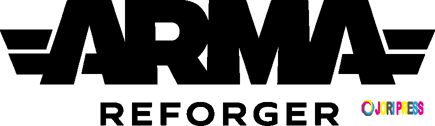
The Arma Reforger logo is simple yet powerful, combining strong typography with military symbolism.
Key Design Elements:
-
Bold Typography
The word “ARMA” is displayed in uppercase with a thick, block-style font. This creates an immediate impression of strength, stability, and authority. Beneath it, the word “Reforger” appears in a lighter, smaller typeface, serving as a subtitle while maintaining balance. -
Wing-like Accents
On either side of the logo, stylized wings or flares extend outward. These are reminiscent of military rank insignias or aviation symbols, further emphasizing the game’s military theme. -
Color Palette
The logo is typically used in monochrome variations — white text on dark backgrounds or black text on light backgrounds. This high contrast ensures clarity and versatility across digital and print media. -
Minimalism
The design avoids unnecessary decoration. Its clean, professional look allows it to remain effective in different sizes and formats, from small game icons to large promotional banners.
What the Logo Represents
Every aspect of the Arma Reforger logo carries meaning:
-
Strength and Realism: The bold typeface mirrors the serious, tactical nature of the game.
-
Military Heritage: The wings and block lettering pay tribute to classic military insignia, linking the game to its Cold War setting.
-
Continuity: The “ARMA” branding connects Reforger with earlier titles in the franchise, reinforcing its legacy.
-
Modern Versatility: Its simple design makes it suitable for modern digital environments, including apps, trailers, and community mods.
Has the Logo Changed Over Time?
Unlike some franchises that frequently rebrand, Arma Reforger’s logo has remained consistent since its announcement. While promotional materials may use different textures, lighting, or backgrounds, the core design — bold typography with winged accents — has not changed. This consistency helps maintain brand recognition while keeping the visual identity strong.
Why a Vector Version Matters
For designers, streamers, or content creators, having access to a vector version of the Arma Reforger logo is extremely valuable.
-
Scalability: Vector files can be resized without losing quality, making them ideal for both small thumbnails and large posters.
-
Clarity: Whether used on a website, video overlay, or print project, the logo remains sharp and professional.
-
Flexibility: Vector files allow easy background removal or color adjustments for custom uses.
? You can get the high-quality Arma Reforger Logo Vector to ensure your projects look polished and authentic.
Design Lessons from the Arma Reforger Logo
The logo offers a few important takeaways for branding and design:
-
Typography is Powerful: A strong, legible font can define the personality of a brand.
-
Minimal Accents Work Best: Subtle details (like the wing motifs) add depth without clutter.
-
Consistency Builds Recognition: Keeping the logo stable across platforms strengthens brand identity.
-
High Contrast Improves Visibility: Black-and-white or monochrome palettes are practical and effective.
Conclusion
The Arma Reforger logo is a striking emblem that perfectly balances tradition with modernity. Its bold typography and military-inspired design reflect the serious, tactical nature of the game while maintaining a clean, professional look. For gamers, designers, and content creators, the logo is not just a visual — it’s a symbol of the franchise’s identity and vision.
What's Your Reaction?
 Like
0
Like
0
 Dislike
0
Dislike
0
 Love
0
Love
0
 Funny
0
Funny
0
 Angry
0
Angry
0
 Sad
0
Sad
0
 Wow
0
Wow
0