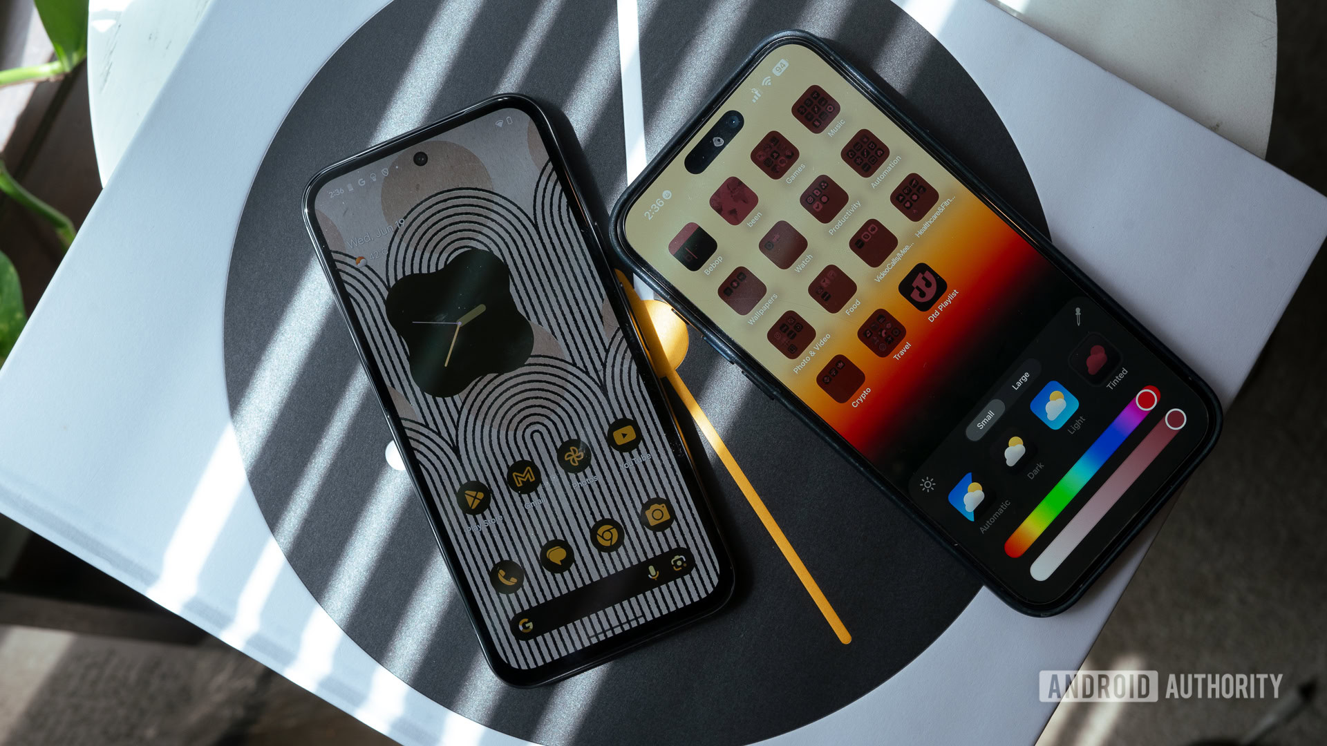
iOS 18’s icon theming is no Material You, but it is a step in the right direction
iOS 18 adds a range of customization features taking a leaf out of Android, but how well does it compare to Material You?

Apple’s neglect of customization on iOS has been a sore point for both long-time iPhone users and dual wielders of Android and iPhones like myself. With iOS 18, Apple is finally addressing this issue and has introduced a plethora of new features, like the ability to move icons wherever you want on the home screen, a reworked control center and, finally, a way to customize app icons. Many of these additions are features Android users have enjoyed for years, but, in typical Apple fashion, it has its own unique twist or set of limitations.
iOS 18's customization upgrades borrows liberally from Android, but adds its own twist.
Now, I’ve been using the iOS 18 developer beta since its release, and I’ve wanted to talk about its customization features since then. But I decided to wait till a few of my most-used apps, like Instagram, got support for iOS 18’s tinting feature to get a better read on how most apps will behave with it. I’ve also been keeping a close eye on my Pixel 8a‘s Material You customizations to see how the two compare. Here are my first impressions of Apple and Google’s two very different approaches to customization, which, surprisingly, share a lot in common.


