








































Why Good UX Design Is Costing New York Businesses Customers (And How to Fix It)
Learn why poor UX costs New York businesses customers and how a trusted website development company in New York can improve conversions in 2026.
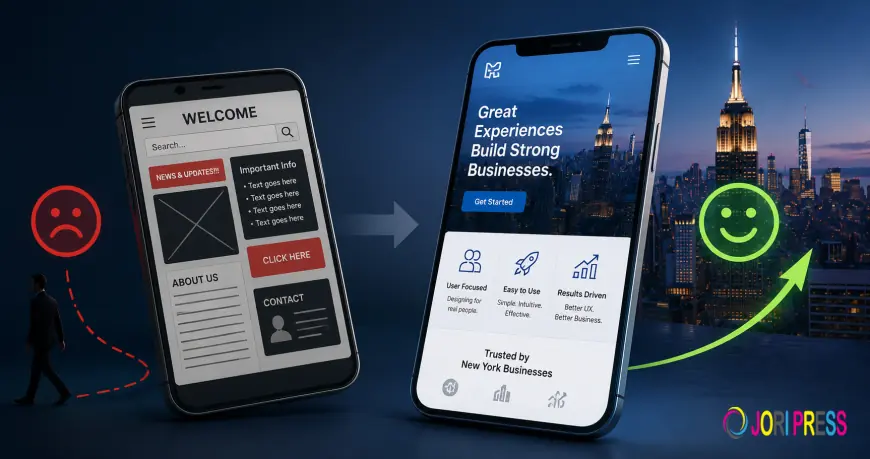
That headline probably sounds backwards. Good UX design should be helping, not hurting. But here's the pattern that shows up constantly among New York businesses: they invest real money in a beautiful redesign, launch it proudly, and watch conversions stay flat, or drop.
The problem usually isn't the design itself. It's that "good UX" got treated as a visual upgrade instead of a friction-removal exercise. Those are very different projects, and confusing them is an expensive mistake. A seasoned website development company in New York understands that effective UX isn't about making a website look better—it's about making every interaction easier, faster, and more likely to convert visitors into customers.
The Real Data on What UX Actually Fixes
Across e-commerce, one pattern shows up again and again: stores that redesign their site without addressing UX don't improve their conversions, according to 2026 e-commerce research. One documented case involved a store stuck at a 1.2% conversion rate despite a solid catalog, competitive pricing, and decent traffic; the actual problem was a seven-step checkout funnel with mandatory account creation and repetitive forms. Fixing the friction, not the visuals, is what moved the number.
This shows up across industries. 78% of restaurant websites lack proper mobile optimization, despite the fact that the majority of their traffic is mobile, according to 2026 restaurant marketing data. 45% of mobile shoppers abandon checkouts because forms are too difficult to fill out, per Baymard's UX research. In both cases, the businesses likely have a website that "looks fine"; the failure is invisible unless you're specifically looking for friction.
The Difference Between "Looks Good" and "Works Well"
A redesign can check every visual box- modern fonts, a cohesive color palette, professional photography- and still underperform if it doesn't address the actual points where users hesitate or give up. Real UX improvement usually looks less exciting than a visual refresh:
- Reducing checkout from seven steps to one can cut abandonment by roughly 20%, according to current UX benchmarks.
- Making a phone number tappable instead of just displayed as text.
- Removing forced account creation before a purchase or booking.
- Cutting page load time by even a fraction of a second, which measurably lifts conversion according to Google's own research.
None of these show up in a portfolio screenshot. All of them show up in your revenue.
Why This Hits New York Businesses Especially Hard
New York customers are impatient by national standards; dense competition means there's almost always an alternative within walking distance or one more tab away. A mobile shopper who hits a confusing form or a slow-loading page doesn't wait around to figure it out; they go somewhere else immediately. That's not a hypothetical; it's the exact behavior showing up in restaurant and retail UX data, where the majority of traffic is mobile and bounce rates run above 50% on underperforming sites.
The Trap: Redesigning Without Measuring
A lot of businesses approach a redesign the wrong way around: they hire a designer, get a new look, launch it, and hope conversions improve. The businesses that actually see results do it differently: they identify specific friction points first, often by literally watching someone unfamiliar try to use the site, then design around fixing those, with the visual refresh happening alongside, not instead of, the functional fixes.
If you're evaluating a redesign right now, ask directly: "What specific friction points will this address, and how will we measure whether it worked?" If the answer is entirely about aesthetics, that's a signal to slow down before committing budget.
What Good UX Actually Looks Like in Practice
- A visitor can complete your primary goal- order, booking, purchase, contact- in the fewest possible taps
- Forms ask only for what's truly necessary at that step, not everything up front
- The site performs identically well on a phone as it does on a desktop, not as an afterthought
- Loading feels instant, or close to it, especially on the pages that lead directly to a conversion
FAQs
How do I know if my website has a UX problem versus just needing better marketing?
Check your bounce rate and your conversion rate at each step of your funnel, not just overall traffic. If people are arriving but leaving quickly, or starting a purchase and abandoning it, that's a UX signal, not a traffic problem; more visitors won't fix it.
Is it worth redesigning my entire site, or can I fix UX issues incrementally?
Incremental fixes targeting specific friction points, checkout steps, form length, and page speed usually deliver faster, more measurable returns than a full redesign, and they let you validate what's actually working before committing to a bigger investment.
Why did my last redesign not improve my conversion rate?
This is common when a redesign focuses on visual refresh without addressing underlying friction, forms, checkout steps, load speed, and mobile usability. A site can look significantly better and still function the same for the user trying to complete an action.
What's the fastest way to identify my site's biggest UX problem?
Watch someone unfamiliar with your business try to complete your primary goal a purchase, a booking, a contact form- on their phone, without guiding them. Wherever they hesitate or get confused is almost always where real customers are dropping off too.
Does good UX design cost more than a standard website redesign?
Not necessarily more, but it requires a different process, one that starts with identifying friction before touching visuals. The return tends to be considerably higher because it directly targets the moments where customers were already about to convert.
Bottom Line
A beautiful website that doesn't remove friction isn't good UX; it's just a nicer-looking version of the same problem. The businesses actually seeing results from their design investment are the ones treating UX as a measurable fix to a specific, identifiable leak, not a visual refresh they hope pays off. That's the mindset every experienced website development company in New York should bring to a project: solving usability problems that drive real business results, not simply delivering a better-looking interface.
What's Your Reaction?
 Like
0
Like
0
 Dislike
0
Dislike
0
 Love
0
Love
0
 Funny
0
Funny
0
 Angry
0
Angry
0
 Sad
0
Sad
0
 Wow
0
Wow
0