Google Maps tweaks UI to waste less screen space
The clean new interface always strives to keep your map within view.
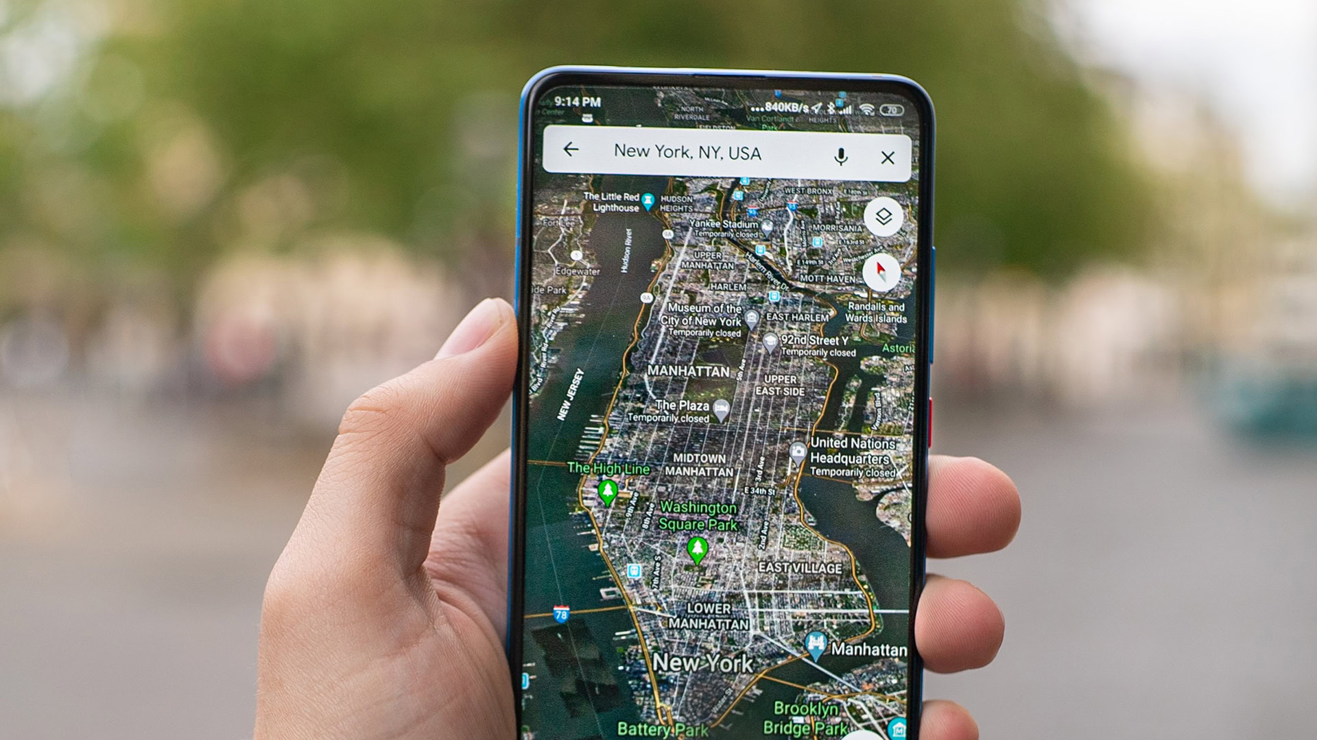
- Google Maps is moving away from full-screen elements to sheets that float above the map.
- Following some small tests earlier this year, the change appears to be rolling out more widely now.
Google is always introducing new services, and while plenty of those don’t pass the test of time, others become institutions that we can barely imagine living without: Gmail, Docs, and of course, Google Maps. For as useful as Maps is, though, have the decades of development it’s gone through and the addition of innumerous features left it in a state of clutter? That’s the impression we got from a poll last year, with readers telling us they wanted to clean up how Maps works. We might finally be starting to see some progress along those lines as Google pushes out a redesign that puts the emphasis back on maps.
Even getting a basic task done in Maps can involve navigating across a bunch of different UI elements: searching for a place, choosing your mode of transit, and previewing steps along the way. While the end result is perfectly functional, Google’s been working on a new way to manage these elements that feels a bit more natural, while keeping the map itself the focus.


