


Google could redesign Android’s volume slider to be more like iOS
- Google is developing a new horizontal layout for Android’s volume slider that will likely appear when the device is in landscape mode.
- This new horizontal slider will be positioned at the top-center of the screen, a design choice similar to the one seen on Apple’s iOS.
- We spotted evidence for this new layout in Android 16 QPR2 Beta 1, but it is not yet active.
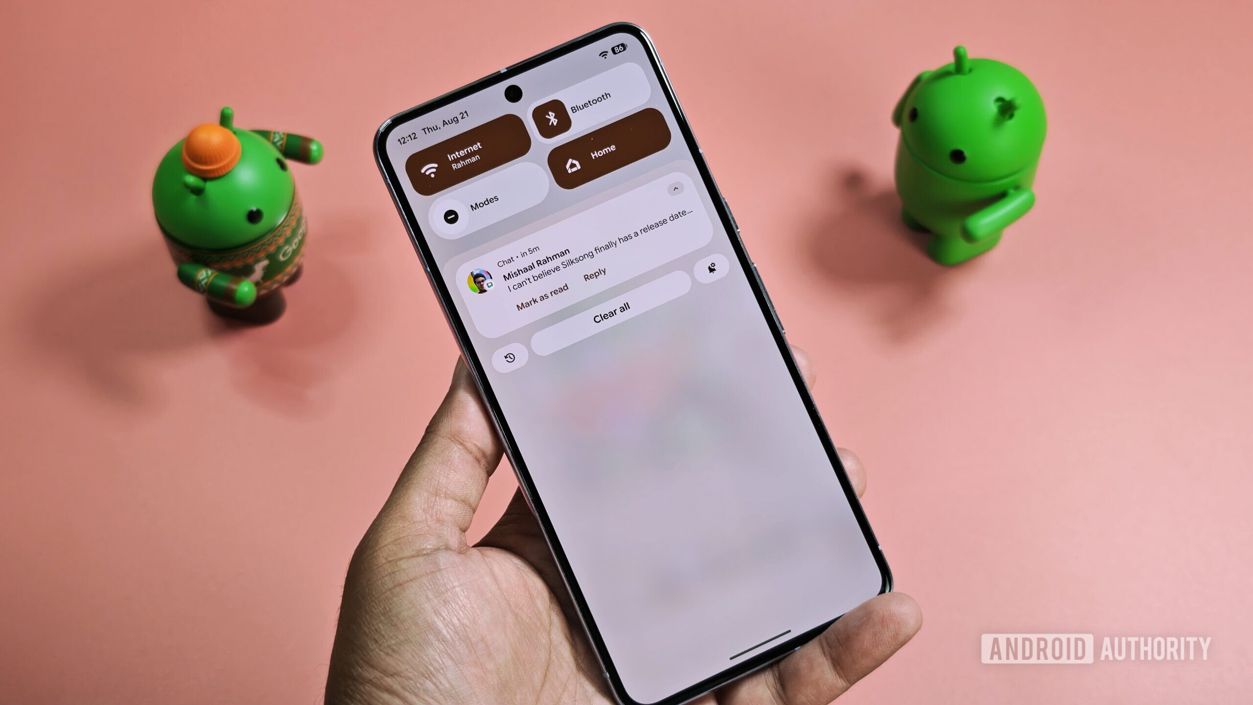
Android’s big Material 3 Expressive redesign brings dramatic changes to the lock screen, status bar, Quick Settings, and notifications, but it also introduces subtle tweaks to other UI elements. The volume slider, for instance, saw several small updates: the dot at the top was replaced with a stream icon, the bar became less rounded, the menu icon morphs into a waveform when music is playing, and a slight bounce effect was added when the bar hits the top or bottom. It seems Google isn’t done modifying Android’s volume slider, though, as we’ve spotted evidence the company is working on a new layout that could bring it more in line with its counterpart on iOS.
You're reading an Authority Insights story. Subscribe to our new Authority Insights newsletter for more exclusive reports, app teardowns, leaks, and in-depth tech coverage you won't find anywhere else.
In the latest Android 16 QPR1 release, the volume slider is positioned vertically along the middle of the screen’s right edge. This layout makes sense when holding a tall smartphone in portrait orientation, as the slider is easy to reach. In landscape mode, however, this vertical layout is less ideal, as it can cover important elements in a game or visuals in a video.
What's Your Reaction?
 Like
0
Like
0
 Dislike
0
Dislike
0
 Love
0
Love
0
 Funny
0
Funny
0
 Angry
0
Angry
0
 Sad
0
Sad
0
 Wow
0
Wow
0