Apple’s designs are ‘iconic’ because of repetition and laziness
Six generations to innovate, same old design.
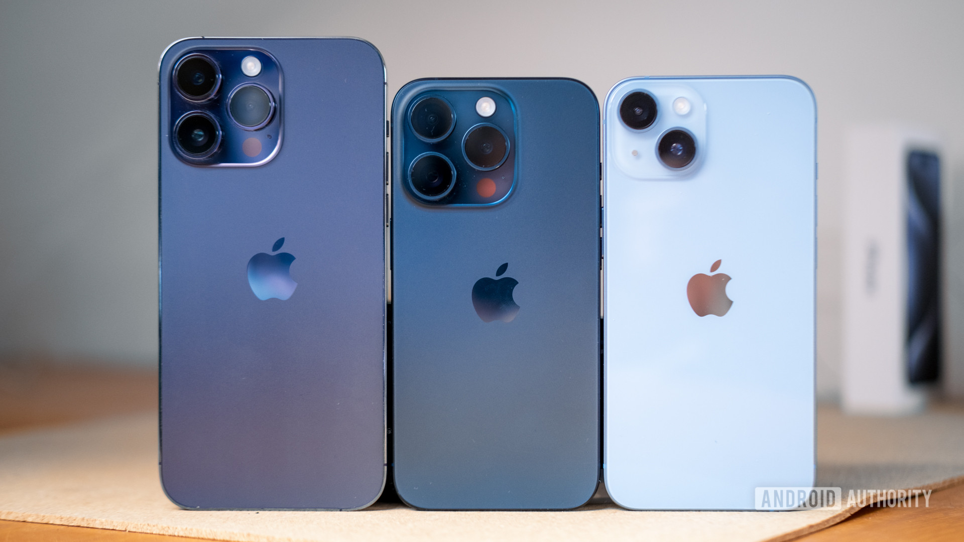

Looking at the new Apple iPhone 16 series, it’s hard to tell what’s new at a glance. Year after year, we’ve seen minor variations on inoffensive colors (with the occasional exciting addition), the familiar boxy metal trim, and an ever-growing camera island. An iPhone always looks like an iPhone, and that’s the way Apple likes it. But it’s not just us in the Android camp who are becoming a little bored by this seemingly lazy approach to smartphone design.
Of course, you can take a closer look at recent iPhones, and you’ll spot the introduction of the Action Button, Dynamic Island, a USB-C port in place of Lightning, the new camera control, and other odds and ends. Things do change, and you’ll find even more specs tweaks from generation to generation. I won’t accuse Apple of being completely bereft of ideas, but all these adjustments are just tinkering around the edges of a core look that the company is clearly hesitant to change. For Apple, design consistency has helped cement brand identity. For us consumers, it’s difficult to get super excited about something that looks and feels very similar to a product we already own.