





































When Does a SaaS Product Need a UX Design Audit? 9 Signals Hidden in Reviews, Support and Analytics
When does a SaaS product need a UX design audit? Spot 9 warning signs in reviews, support tickets, and analytics, and learn what US teams should fix first.

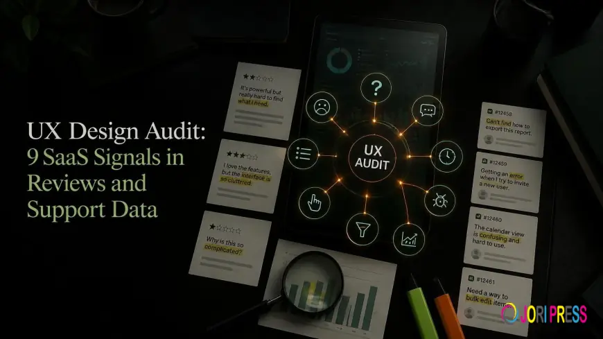
A SaaS product needs a UX design audit when the same friction shows up in three places - your reviews, your support inbox, and your analytics. One grumpy review is noise. A grumpy review, six support tickets, and a funnel drop on the same screen is a pattern. Your team probably already has all of this evidence. It just lives in tools nobody opens side by side.
What Do Reviews Tell You About Your SaaS UX Design?
Review sites like G2 and Capterra (and the App Store, if you have a mobile app) are blunt in a way user interviews rarely are. People aren’t trying to be polite. They’re trying to warn the next buyer.
1. Powerful, but…
You’ll know this review when you see it. Five stars for features, then a line like “there’s a steep learning curve” or “it took our team weeks to get comfortable.”
That’s a design problem dressed up as a compliment. Users can see the value, but they’re struggling to reach it.
What to check: which screens reviewers mention by name. If “reports” or “the editor” keeps coming up, start there.
2. Reviewers name an easier competitor
“We moved to another tool because setup took ten minutes instead of a week.” Ouch.
When ease of use is the reason people leave, your SaaS UX design is losing deals your features should be winning. Read the reviews of the competitors they mention too. Whatever their users praise is a free design brief.
3. Ratings dip after a release
A new navigation ships on a Tuesday. By the following week, three-star reviews started mentioning “the new layout” and “can’t find anything anymore.”
People rarely hate change on its own. They hate losing things they know how to find. Line up review dates against your release notes and see whether any dips match.
Which Support Tickets Point to a UX Problem?
Support teams feel friction first, often weeks before it shows up in a dashboard. If you use Zendesk, Intercom, or Help Scout, your ticket tags and saved replies are a goldmine here.
4. The same “How do I…?” every week
“How do I export my data?” “Where do I invite my team?” “Can I change my billing date?”
If your team has a saved reply for it, the feature probably needs a better home in the interface. A help article is a patch. Moving the button is the fix.
5. Bug reports that aren’t bugs
A customer writes in, annoyed: “Save doesn’t work.”
It does. The button just stays grayed out until a required field further down the page is filled in, and nothing on screen says so. Engineering closes the ticket as “not a bug,” and the next person hits the same wall.
Tickets like these are pure design debt. Ask support to tag them separately so they stop disappearing.
6. Accessibility complaints
Messages about keyboard navigation, screen readers, or hard-to-read text need quick attention. They’re often the tip of a bigger problem, because plenty of people who struggle won’t bother writing in at all.
For US companies, there’s a legal side too. Accessibility gaps can create ADA risk, and WCAG gives you a clear standard to check against.
What Analytics Signals Mean It’s Time for a UX Design Audit?
Numbers won’t tell you why something’s broken. They will tell you exactly where to look. Funnel reports in Mixpanel, Amplitude, or GA4 cover most of what you need.
7. Signups that never activate
Someone starts a trial, clicks around for two minutes, and never logs in again.
Weak SaaS onboarding UX is the usual suspect. Maybe the setup checklist has eight steps, or the first screen is an empty dashboard with no hint of what to do next. Find the step where new users stop, then watch a handful of session recordings from that exact point.
8. Features nobody finds
You spent a quarter building custom reports. Usage is flat.
Before you call the feature a flop, check where it lives. Tucked behind a settings icon or three levels deep in a menu, even a great feature stays invisible. Discoverability is one of the first things a proper user experience audit looks at. For a quick test of your own, ask five customers to find the feature without help, and time them.
9. Rage clicks on pricing or upgrade pages
Microsoft Clarity and Hotjar both flag rage clicks and quick U-turns. When those cluster on your pricing page, people want to pay you and can’t work out how.
Plan names that don’t explain the difference are a frequent culprit. So is an “Upgrade” button that dumps people onto a generic contact form. A UX site audit of your public pages is worth doing alongside the in-app review, since that’s where many upgrades start.
What Doesn’t Count as a Signal?
Not every complaint needs an audit. Leave these out:
-
One furious review from someone who signed up for the wrong product
-
Feature requests (“Can you add a Gantt chart?”) which are product decisions rather than design problems
-
Pricing complaints, unless people are confused by the pricing rather than unhappy with the price
How Do You Pull These Signals Together in One Afternoon?
You don’t need a research team for this. A spreadsheet and a few hours will do.
|
Source |
Where to look |
What to note |
|
Reviews |
G2, Capterra, App Store (last 90 days) |
Screens or features named in complaints |
|
Support |
Ticket tags, saved replies, “not a bug” closures |
Repeated questions and the page they relate to |
|
Analytics |
Funnel reports, feature usage, rage-click maps |
The step or page where people stop |
Then sort everything by page or flow. Anything that shows up in two or three columns goes to the top. That short list becomes the scope of your UX design audit, and it stops you from trying to audit UX design across the entire product at once.
How Do You Run a UX Design Audit Once the Signals Show Up?
Three or more signals pointing at the same flow is a good reason to act. Start there, whether it’s onboarding, the editor, or the pricing page.
-
Get a baseline first. An automated audit of your key pages takes minutes. UX Audit Tool is free to use, so you can run an audit here before you plan anything.
-
Compare options if you want a second opinion. This roundup of UX audit tool covers what different tools check and where each one stops.
-
Bring in people for the messy parts. Automated checks catch a lot, but complex flows like multi-step onboarding benefit from human review. That’s where UX audit services earn their place.
For SaaS-specific depth, see how a UX design audit lifts SaaS conversions across trials and onboarding. If you also run a marketing site for US customers, this guide to a website UX audit for US businesses covers that side.
After that, fix one thing at a time and recheck the same signal a few weeks later. If activation was the problem, rework the SaaS onboarding UX first and watch activation. A user experience audit that doesn’t move the number it was meant to move deserves a second look.
Summing It Up
Block out an hour this week. Open your review sites, support inbox, and analytics side by side, and note which of these nine signals show up in more than one place. That overlap is where your UX design audit should start, and it’s usually smaller and more fixable than it looks from the outside. If you’d like help reading what you find, get in touch with the UX Audit Tool team.
What's Your Reaction?
 Like
0
Like
0
 Dislike
0
Dislike
0
 Love
0
Love
0
 Funny
0
Funny
0
 Angry
0
Angry
0
 Sad
0
Sad
0
 Wow
0
Wow
0