


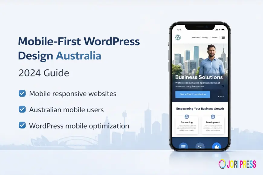
Mobile-First WordPress Design: Why Australian Customers Demand It
Why 85% of Australian customers demand mobile-first websites. Learn how mobile-first WordPress design improves rankings, speed, and conversions in 2024.
Australia is a mobile-first nation. Over 85% of Australians own smartphones, and more than 58% of website traffic now comes from mobile devices. For many industries, mobile usage is even higher. If your website isn’t built for mobile first, you’re losing customers before they even read your content.
Mobile-first design is no longer a trend — it’s a business requirement.
At skwebsketch, we specialise in building high-performance WordPress websites designed mobile-first from day one — ensuring speed, usability, and SEO strength across all devices.
Here’s why mobile-first WordPress design in Australia is essential in 2024 and beyond.
1. Australian Mobile Usage Statistics
Smartphone Penetration
Australia consistently ranks among the highest smartphone adoption markets globally, with over 85% ownership.
Mobile vs Desktop Behaviour
-
58% overall web traffic is mobile
-
Retail: 72% mobile browsing
-
Hospitality: 68% mobile browsing
-
Service-based businesses: Growing rapidly
Younger audiences (18–34) rely almost entirely on mobile browsing, while even older demographics increasingly prefer smartphones for quick searches.
Mobile is now the primary digital touchpoint.
2. What is Mobile-First Design?
Mobile-first design means designing for smaller screens first, then scaling up for tablets and desktops.
Mobile-First vs Responsive
Responsive design adapts desktop layouts to smaller screens.
Mobile-first design prioritises mobile experience from the beginning — cleaner, faster, simpler.
Google Mobile-First Indexing
Google introduced mobile-first indexing in 2019, meaning it primarily uses the mobile version of a website for ranking and indexing.
If your mobile site underperforms, your rankings suffer.
Our WordPress websites are built mobile-first from the ground up, ensuring optimal performance, SEO structure, and user experience across Australian markets.
3. Business Impact of Mobile Optimisation
Conversion Rates
Mobile-optimised websites convert up to 160% better than non-optimised sites.
Australian consumers expect:
-
Fast loading
-
Clear navigation
-
Easy checkout
-
Click-to-call functionality
If your site is hard to use on mobile, users leave instantly.
Search Rankings
Google considers:
-
Mobile usability
-
Mobile page speed
-
Core Web Vitals
Page speed is critical. Studies show 53% of users leave if a site takes more than 3 seconds to load.
User Experience
Australian consumers demand:
-
Frictionless browsing
-
Thumb-friendly layouts
-
Fast product access
-
Clear contact forms
A poor mobile experience damages brand credibility.
Competitive Advantage
Only about 42% of small Australian businesses are fully mobile-optimised.
That creates opportunity.
Businesses investing in mobile-first WordPress design gain:
-
Higher rankings
-
Lower bounce rates
-
Stronger engagement
-
Increased trust
4. Key Mobile-First Design Principles
Touch-Friendly Navigation
-
Minimum button size: 44×44 pixels
-
Thumb-accessible menus
-
Hamburger navigation
-
Clear spacing between elements
Simplified Content Layout
-
Single-column design
-
Short paragraphs
-
Clear headings
-
Scannable content blocks
Mobile users skim — they don’t read walls of text.
Optimised Images
-
WebP format
-
Responsive image scaling
-
Lazy loading implementation
Heavy images slow down Australian mobile users, especially in regional areas.
Fast Loading Speed
Australian mobile networks vary in performance. Optimisation must consider:
-
3G compatibility
-
Compressed assets
-
Clean theme structure
AMP can be considered in news-style websites, but strong WordPress optimisation often makes AMP unnecessary.
Readable Typography
-
Minimum 16px font size
-
Proper line height
-
Strong contrast ratios
Legibility equals usability.
5. WordPress Mobile Optimisation Tools
Effective tools include:
-
Mobile-optimised WordPress themes
-
WPtouch
-
Jetpack (mobile features)
-
Google PageSpeed Insights
-
Google Mobile-Friendly Test
Australian hosting quality also directly impacts mobile performance.
6. Testing Your Mobile Design
Proper testing includes:
-
iPhone devices
-
Samsung Galaxy devices
-
Google Pixel devices
-
Safari and Chrome mobile browsers
Real user monitoring and heat mapping tools help identify drop-off points.
7. Common Mobile Design Mistakes
Avoid:
-
Videos that don’t load properly
-
Pop-ups covering content
-
Tiny clickable buttons
-
Horizontal scrolling
-
Long, complicated forms
Every extra step reduces conversions.
Conclusion
Mobile-first WordPress design in Australia is no longer optional. With 85% smartphone penetration and mobile-first indexing, businesses must prioritise speed, usability, and mobile SEO to remain competitive.
The future will amplify this shift with:
-
Voice search growth
-
5G expansion
-
AI-driven search results
If your website isn’t mobile-ready, you’re already behind.
Is your website mobile-ready? Get a free mobile audit from SKWebSketch today and future-proof your online presence.
What's Your Reaction?
 Like
0
Like
0
 Dislike
0
Dislike
0
 Love
0
Love
0
 Funny
0
Funny
0
 Angry
0
Angry
0
 Sad
0
Sad
0
 Wow
0
Wow
0